Timberwolves Logo Rated Best In NBA
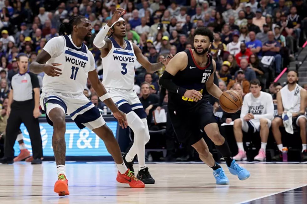
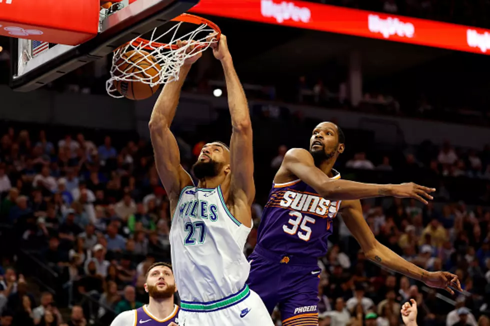
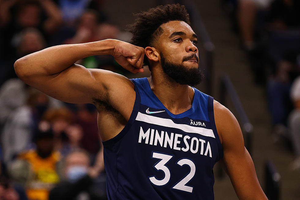
The Minnesota Timberwolves have the best logo in the National Basketball Association according to a survey conducted by Quality Logo Products. Minnesota United also was ranked as having the best logo in Major League Soccer.
A total of 1,036 people were asked to put any personal bias aside to rank the logos. The questions included both multiple choice and comment-box based questions.
Without further ado, here is how the logos for Minnesota's professional sports teams ranked in the survey!
NBA: TIMBERWOLVES (#1 NBA, #6 Overall)
According to Quality Logo Products, "The Timberwolves’ original logo when they joined the NBA back in 1989 looked more like a panting Siberian husky. Needless to say, they’ve improved on that, and respondents felt the same."
NFL: VIKINGS (#16 NFL, NR Overall)
In my opinion, the Vikings logo is criminally underrated here. It's a timeless classic!
MLB: TWINS (#25 MLB, NR Overall)
Oof. I hate to say it, but I kind of agree with this ranking. I love the Twins but I have always thought the 'Twins' with the WIN underline was kind of weak. I do like the 'TC' logo though.
NHL: WILD (#9 NHL, NR Overall)
I don't really understand the Wild logo but I have started to get used to it after 20 years. Is it a bear? A picture of an outdoor setting with a river and trees? Both?
MLS: MN UNITED FC (#1 MLS, #10 Overall)
Per Quality Logo Products: "Minnesota United joined the MLS just six years ago, but it already has the top logo. The team, known as the Loons, has a logo with clear contrast: A black loon, with its single visible wing stretched out in profile, against a light background of faded gray and sky blue. It’s easy to read and instantly recognizable. It was also voted the most interesting/unique logo."
See the full results HERE.
Viking Head Coaching Candidates
More From 1390 Granite City Sports
![Which Minnesota Men’s Sports Team Is Closest To Winning A Championship? [OPINION]](http://townsquare.media/site/70/files/2022/04/attachment-IMG_8409.jpg?w=980&q=75)


